
Chapter 11
General Explanation of the Charts
Why December 7, 1950 was Chosen for Analysis
The title of this book, perhaps, should have been: "Whatever Happened to the Weather over the Northern Hemisphere at 1230 G.M.T., 7 December 1950?". I chose that moment in time to show the order and the symmetry of weather patterns. The type of regularity shown is present all the time, continuously, and has been present ever since the Earth has had its atmosphere; and will exist for as long as the Earth cares to remain in one piece with an atmosphere. This regularity also exists on all the planets in the Universe that have an atmosphere.
Nevertheless, the date of December 7, 1950 was chosen for two special reasons. First, and foremost, there were no satellite observations or computer calculations available to draw and interpret the maps of 1950. I wanted to show that uncanny regularity and accuracy of the weather maps was present, even though the skilled analysts who drew the maps, at the time, did not fully appreciate how good they were. Second, a map was chosen with a significant number of highs and lows for which a center could be defined with a minimum of controversy. There are many days in the series of Historical Weather Maps where the centers of the highs and lows are difficult to define. This difficulty may be due to the distorted shapes of some of the weather systems, or the failure of the analysts to identify the pressure centers exactly--they never considered the centers to be that important--this attitude is still held by most present day meteorologists. There are many other days that could have been used quite satisfactorily, instead of December 7, 1950, but I chose it simply because it seemed the best of the first seven days, when I started checking that month.
Why June 6, 1944 was Chosen
I also include a short analysis for 1230 G.M.T., June 6, 1944, the date of the invasion of Europe by the Allied Forces in World War II. The importance of the weather forecast for that day is well known and it has been analyzed and reanalyzed many times over. The analysis that I show has never been made or seen before.
I chose the date of June 6, 1944 to show that the day of December 7, 1950 was not unique, if any of my readers should wonder. In addition, we gain the insight that the principles established for a wintry day in December, are the same in the month of June. I have personally checked every recognizable pressure center for every day of every Historical Weather Map for all the months from August to March, inclusive, for all the years 1940 to 1965. I have found that the same rules illuminated in the examples of this book always apply; you might have to scratch your head occasionally, but everything is always in order.
Some Rules Followed in the Drawing of the Charts
Some general, preliminary information, will help in understanding how the charts for December 7 were constructed. In the Identification Map (page 109), a number has been assigned to every high, low and col, that I have chosen to use in the charts. There are additional points on the map that could have been included, but were not for the following reasons:
The order in which the numbers were chosen and the pattern formed by the numbers have no special significance. It was Daniel Bender's suggestion to start the numbers at the top and work down.
In the charts, lows, highs, or cols will usually be referred to, only, by a given number. For example, high number 58 will be referred to simply as #58; low number 76 will be referred to as #76, without designating it as a low; likewise, the col at point number 52 will be referred to as #52.
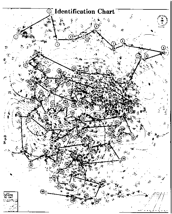
Register crosses are used in the Identification Map to show the actual location of the centers for a given high, low, or col.
Table IX is a listing of the latitude and longitude for each of the
104 points chosen. These numerical values were measured on the master chart
used to construct the charts in this book. The register crosses in the
Identification map were located carefully, but the values indicated
in the table take priority for accuracy in all cases. The actual values
that were chosen depended on a multitude of factors and principles. It
is not possible to present all of the principles used in this first opening
book. Nevertheless, I can not lay claim to infallibility as to the locations
of the 
centers (especially for the obscure points), and further analysis might lead to slight alterations. Nevertheless, the accuracy of Table IX can be seen from the wide range of symmetry patterns developed in the charts. These symmetry patterns could not exist or would be distorted to unrecognizable shapes, if there were any significant errors.
Some Unusual Aspects of the Charts
It may come as a surprise to you that the symmetry patterns shown in the charts are not affected by location in mountainous terrain or in the open sea; that patterns are also not affected by the size, shape, intensity, or distance between the highs and lows that make up the elements of the symmetry patterns. This is not to say that the type of symmetry that occurs has not been caused or influenced by these factors. These symmetry patterns reach out in all directions across the hemisphere, regardless of their cause or causes.
Other features of the weather maps, such as troughs, ridges, and cols are also part of some type of symmetry pattern. As a matter of fact, every change in curvature of the isobars on the surface chart fit precisely into some symmetry pattern-this, however, is not proven in this book.
Some Simple Definitions of Simple Weather Terms
A few definitions are in order for those of you who are not hardcore meteorologists. Isobars are lines that are drawn on charts to indicate points of equal barometric pressure along a surface of constant height. This surface can be sea level or any level at any height desired above sea level. The winds usually blow at some relatively small angle with respect to these isobaric lines, so that an isobaric pattern is a general indication of the direction the wind is blowing. A trough is a change of curvature in the isobars where the wind that blows along the isobars moves in a counterclockwise direction. A ridge is also a change of curvature in the isobars where the wind that blows along the isobars moves in a clockwise direction. A col is a point where there is no wind at all between two or more adjacent highs, or between two or more adjacent lows.
What is the Center of a Low or High and how is it to be Determined?
It is extremely important to locate the centers of highs and lows with as great an accuracy as possible, (contrary to current belief by most meteorologists). The charts would have been difficult to construct without having accurate center locations of the pressure centers. When making angular measurements and calculations between three or more pressure centers that are any distance up to 12,000 miles apart, small errors in the location of the centers can be greatly magnified. When the center can be easily located by the shape of the isobars, there is no problem; but in a large number of cases, there appears to be no organized center. A large misshapen rock composed of minerals with varying density also has no apparent or visible center. Nevertheless, a center of gravity can be found, and can be invaluable for making calculations involving force and torque when the rock is moved. Similarly, since force and torque are also involved in the movements of high and low centers; a center of action can be located for them, even if there appears to be no organized or visible exact center. In addition, there are some seemingly disorganized pressure centers that are in reality well organized clusters of small centers inside an extended pressure center area. In that case, there are indeed well defined high or low centers, but very small ones.
The more that a vortex departs from a circular shape, the more difficult it may be to locate the center. We know from Plateau's surfaces of revolution that any circular shape subjected to varying forces can change into the other conic surfaces of revolution related to the ellipse, parabola, hyperbola, etc. As an empirical observation, we find that most lows and highs elongate, breakup, and become distorted-generally into an elliptical shape. The parabolic and hyperbolic and other shapes undoubtedly occur, but from a practical or empirical standpoint, any irregular vortex is considered as being elliptically shaped or consisting of several circular and elliptical shapes. Pressure centers #40, #37, and #39 are elliptical in shape, just to name a few on the map.
Changes in the length of either or both the major and minor axis will, of course, change the shape of the ellipse. A question now arises: What is the center of an elliptical high or low? I have found (on the
Historical Weather Maps) that the symbols "L" and "H" (which stand for low or high) stamped somewhere inside a vortex center, are generally quite accurate; and usually identify a point that can be recognized as the center point, equivalent to point O in Figure 8-4, or one of the focal points F and F' of the ellipse. The center of a high frequently lies near the center of the crossbar joining the two sides of the letter "H", while the center of a low is near the junction where the two legs of the letter "L" meet; nevertheless, this is not always the case.
This is all well and good for the internal structure of an elliptical vortex. However, another high or low next to an elliptical vortex may consider either of the two focal points or the central point as being the center of its elliptical neighbor. How an elliptical vortex "looks" to the center of a different but nearby vortex depends somewhat on which of the three centers of the ellipse is closest to the center of the nearby vortex.
The high represented by #17, #18, and #19, and the lows represented by #91, #93, and #103 on the Identification Map are examples similar to the collapsing cylinder of Plateau's liquid cylinders, only here we have air cylinders.
I draw many straight lines on the charts. For all practical purposes, we can be virtually certain that any straight line that crosses an elliptical vortex exactly along the major axis will cross all three possible center points, shown in Figure 8-4. Similarly, if the line crosses exactly along the minor axis, we can be reasonably certain of crossing the center of the ellipse. In these examples, we can be fairly certain that the straight line is crossing the center points of the vortex.
You may be wondering as to why I am concentrating on such seemingly minute details as identifying three centers of an elliptical vortex. If you were to ask any practicing meteorologist, he would probably consider it unreasonable to even attempt to identify the exact center, let alone three (or more) centers for any high or low on a weather map. Also, he might feel that the data on the Historical Weather Maps is insufficient and/or not accurate enough to resolve the question of centers in the detail that I am considering. The charts that I show, as you will shortly see, will alleviate these doubts. Of course, it is not possible to identify all the obscure centers on a given weather map,
but it is astonishing how many seemingly irregular centers can be properly identified when using the proper theory and tools.
Two Types of Chart Analysis: Circumferential and Radial
The analysis of what happened on December 7, 1950 is broken down into two major divisions. In the first division, we subject each one of 30 different points on the map to a harmonic analysis that exposes the circumferential patterns; while in the second division, we subject the chosen 30 to a radial analysis. The circumferential patterns are similar to the Chladni plates shown in Figure 9-2, where the diametrical lines break up a circumference into different wavenumbers depending on the number of diameters that are created. The radial patterns are similar to Figure 9-3, where we encounter different rings as we move out radially from the center of a disturbance.